
Line Charts from SQL Data
Line charts are used to display trends and changes over time.
In this tutorial, the number of security events per day will be displayed using a line chart.
Step 1 - Create the SQL Query
The following query counts the number of events recorded each day.
SELECT

    DATE(event_timestamp) AS event_date,

    COUNT(*) AS total

FROM cyber_security_events

GROUP BY DATE(event_timestamp)

ORDER BY event_date;
Example result:
| event_date | total |
|---|---|
| 2026-06-01 | 12 |
| 2026-06-02 | 18 |
| 2026-06-03 | 9 |
| 2026-06-04 | 15 |
Step 2 - Retrieve the Data with PHP
<?php

$sql = "

SELECT

    DATE(event_timestamp) AS event_date,

    COUNT(*) AS total

FROM cyber_security_events

GROUP BY DATE(event_timestamp)

ORDER BY event_date

";

$result = $pdo->query($sql);

$data = [];

while($row = $result->fetch())
{

    $data[] = [

        $row['event_date'],

        (int)$row['total']

    ];

}

?>
Step 3 - Create the Chart Container
<div id="chart_div"
     style="width:100%; max-width:900px; min-height:320px;">
</div>
Step 4 - Create the Line Chart
<script>

google.charts.load(
    'current',
    {'packages':['corechart']}
);

google.charts.setOnLoadCallback(drawChart);

function drawChart()
{

    var data =

        google.visualization.arrayToDataTable([

        ['Date','Events'],

        ...<?php echo json_encode($data); ?>

    ]);


    var options = {

        title:'Security Events Over Time',

        curveType:'function',

        legend:{position:'bottom'}

    };


    var chart =

        new google.visualization.LineChart(

            document.getElementById('chart_div')

        );


    chart.draw(data, options);

}

</script>
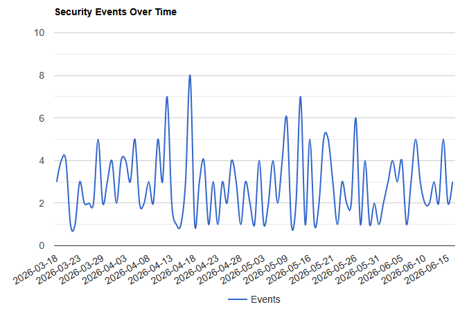
Understanding the Chart
The horizontal axis displays:
Date
The vertical axis displays:
Number of Security Events
This makes it easier to identify:
- Busy periods
- Trends over time
- Sudden increases in activity
- Patterns in the data
Complete Example
<?php

$sql = "

SELECT

    DATE(event_timestamp) AS event_date,

    COUNT(*) AS total

FROM cyber_security_events

GROUP BY DATE(event_timestamp)

ORDER BY event_date

";

$result = $pdo->query($sql);

$data = [];

while($row = $result->fetch())
{

    $data[] = [

        $row['event_date'],

        (int)$row['total']

    ];

}

?>

<!DOCTYPE html>

<html>

<head>

<script src="https://www.gstatic.com/charts/loader.js"></script>

</head>

<body>

<div id="chart_div"
     style="width:100%; max-width:900px; min-height:320px;">
</div>


<script>

google.charts.load(
    'current',
    {'packages':['corechart']}
);

google.charts.setOnLoadCallback(drawChart);

function drawChart()
{

    var data =

        google.visualization.arrayToDataTable([

        ['Date','Events'],

        ...<?php echo json_encode($data); ?>

    ]);


    var options = {

        title:'Security Events Over Time',

        curveType:'function',

        legend:{position:'bottom'}

    };


    var chart =

        new google.visualization.LineChart(

            document.getElementById('chart_div')

        );


    chart.draw(data, options);

}

</script>

</body>

</html>
Accessibility and data note
Provide the values in an HTML table or concise text summary as well as the chart. Do not rely on colour alone, and give the chart container an accessible name where practical. Google Charts loads JavaScript from Google; use fictional or non-personal summary data only.