# Line Charts from SQL Data

Line charts are used to display trends and changes over time.

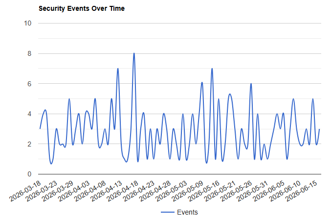
In this tutorial, the number of security events per day will be displayed using a line chart.

---

## Step 1 - Create the SQL Query

The following query counts the number of events recorded each day.

```sql
SELECT

    DATE(event_timestamp) AS event_date,

    COUNT(*) AS total

FROM cyber_security_events

GROUP BY DATE(event_timestamp)

ORDER BY event_date;
```

Example result:

| event_date | total |
|------------|------:|
| 2026-06-01 | 12 |
| 2026-06-02 | 18 |
| 2026-06-03 | 9 |
| 2026-06-04 | 15 |

---

## Step 2 - Retrieve the Data with PHP

```php
<?php

$sql = "

SELECT

    DATE(event_timestamp) AS event_date,

    COUNT(*) AS total

FROM cyber_security_events

GROUP BY DATE(event_timestamp)

ORDER BY event_date

";

$result = $pdo->query($sql);

$data = [];

while($row = $result->fetch())
{

    $data[] = [

        $row['event_date'],

        (int)$row['total']

    ];

}

?>
```

---

## Step 3 - Create the Chart Container

```html
<div id="chart_div"
     style="width:900px; height:500px;">
</div>
```

---

## Step 4 - Create the Line Chart

```html
<script>

google.charts.load(
    'current',
    {'packages':['corechart']}
);

google.charts.setOnLoadCallback(drawChart);

function drawChart()
{

    var data =

        google.visualization.arrayToDataTable([

        ['Date','Events'],

        ...<?php echo json_encode($data); ?>

    ]);


    var options = {

        title:'Security Events Over Time',

        curveType:'function',

        legend:{position:'bottom'}

    };


    var chart =

        new google.visualization.LineChart(

            document.getElementById('chart_div')

        );


    chart.draw(data, options);

}

</script>
```

[![](https://mr.napper.au/uploads/images/gallery/2026-06/scaled-1680-/image-1782086063395.png)](https://mr.napper.au/uploads/images/gallery/2026-06/image-1782086063395.png)

---

## Understanding the Chart

The horizontal axis displays:

```text
Date
```

The vertical axis displays:

```text
Number of Security Events
```

This makes it easier to identify:

- Busy periods
- Trends over time
- Sudden increases in activity
- Patterns in the data

---

## Complete Example

```php
<?php

$sql = "

SELECT

    DATE(event_timestamp) AS event_date,

    COUNT(*) AS total

FROM cyber_security_events

GROUP BY DATE(event_timestamp)

ORDER BY event_date

";

$result = $pdo->query($sql);

$data = [];

while($row = $result->fetch())
{

    $data[] = [

        $row['event_date'],

        (int)$row['total']

    ];

}

?>

<!DOCTYPE html>

<html>

<head>

<script src="https://www.gstatic.com/charts/loader.js"></script>

</head>

<body>

<div id="chart_div"
     style="width:900px; height:500px;">
</div>


<script>

google.charts.load(
    'current',
    {'packages':['corechart']}
);

google.charts.setOnLoadCallback(drawChart);

function drawChart()
{

    var data =

        google.visualization.arrayToDataTable([

        ['Date','Events'],

        ...<?php echo json_encode($data); ?>

    ]);


    var options = {

        title:'Security Events Over Time',

        curveType:'function',

        legend:{position:'bottom'}

    };


    var chart =

        new google.visualization.LineChart(

            document.getElementById('chart_div')

        );


    chart.draw(data, options);

}

</script>

</body>

</html>
```